Website Redesign
Role & Company
Design Director at Lotame, a global B2B data, audience management, and advertising technology company.
Impact
✓ Improved engagement metrics, site speed/core web vitals, and key content pageviews
✓ WCAG AA compliance
✓ Design system adoption, efficiency gains, and fewer support requests
Background
Lotame’s marketing website had not been redesigned in over 7 years. Because the backend codebase was bloated, website functionality would unexpectedly break, and SEO suffered due to poor load times. Additionally, the website’s inflexible information architecture made it difficult to promote new offerings as the company evolved.
Given these challenges, the Marketing team launched a full overhaul of the website from the ground up, moving to a more modern Wordpress backend with SEO, accessibility, and UX goals in mind. My role in the project was to develop and execute a discovery, research, design, and roll out strategy.
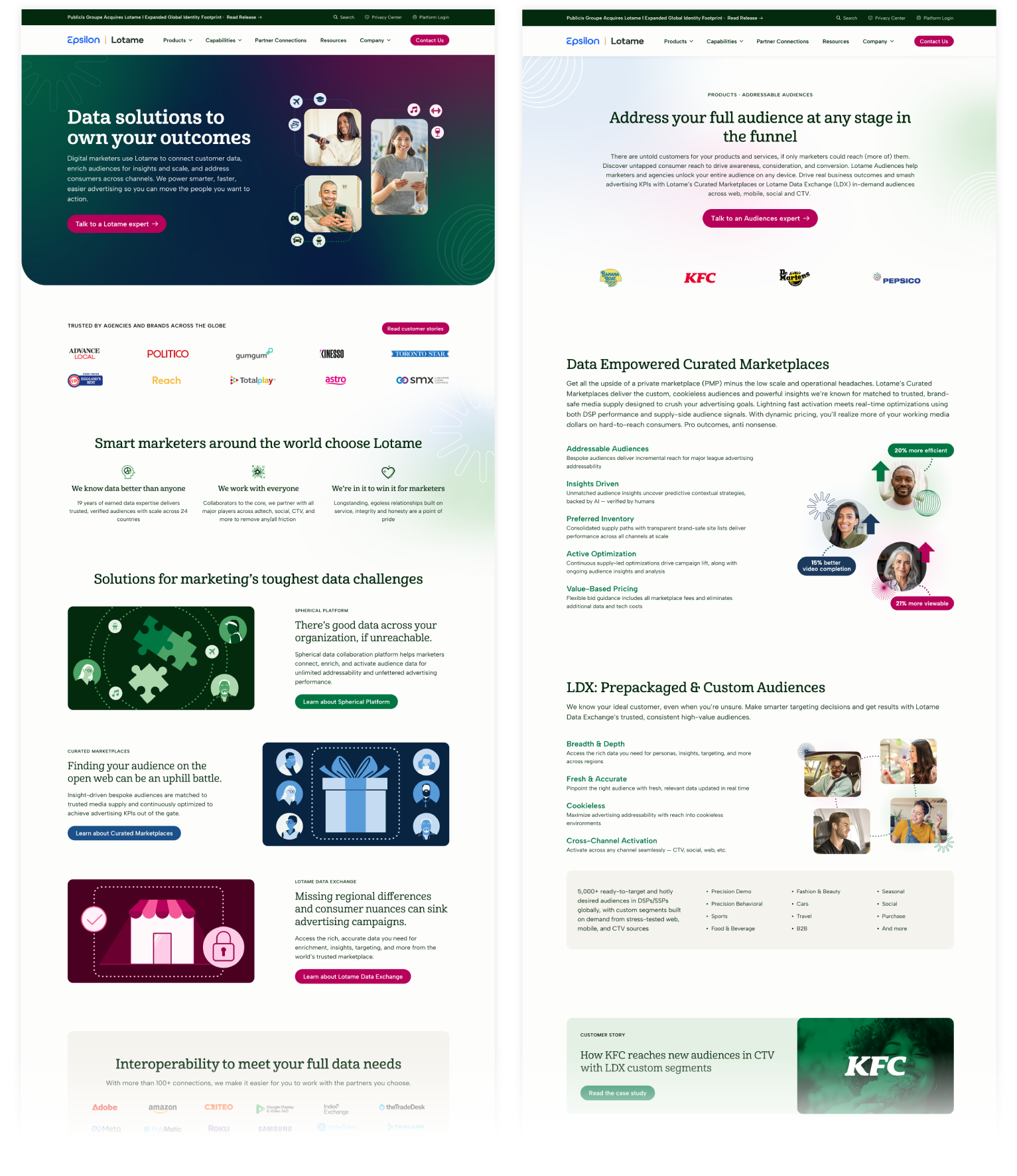
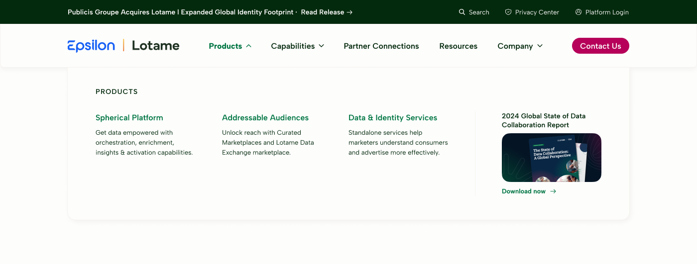
Pictured below are designs for the Home and Products pages. During stakeholder interviews, we found that users were confused about our company’s products and capabilities. I developed simple storytelling visuals to help users quickly understand our complex offerings.
Process & Deliverables
Collaborating with the Marketing team and external web developer, I developed a strategy that encompassed research, information architecture exploration, wireframing, and visual design. I oversaw the process from concept to launch, including managing QA testing and post-roll out tasks. The website was designed to meet Level AA Web Content Accessibility Guidelines (WCAG).
Discovery & Research
Website content audit
Heuristic evaluation
Stakeholder interviews
Heat maps and session recordings
Competitive audit
Qualitative reporting
Information architecture, including navigation and marketing content
Wireframing & Visual Design
Visual design for 20+ pages, as well as a robust blog and privacy center
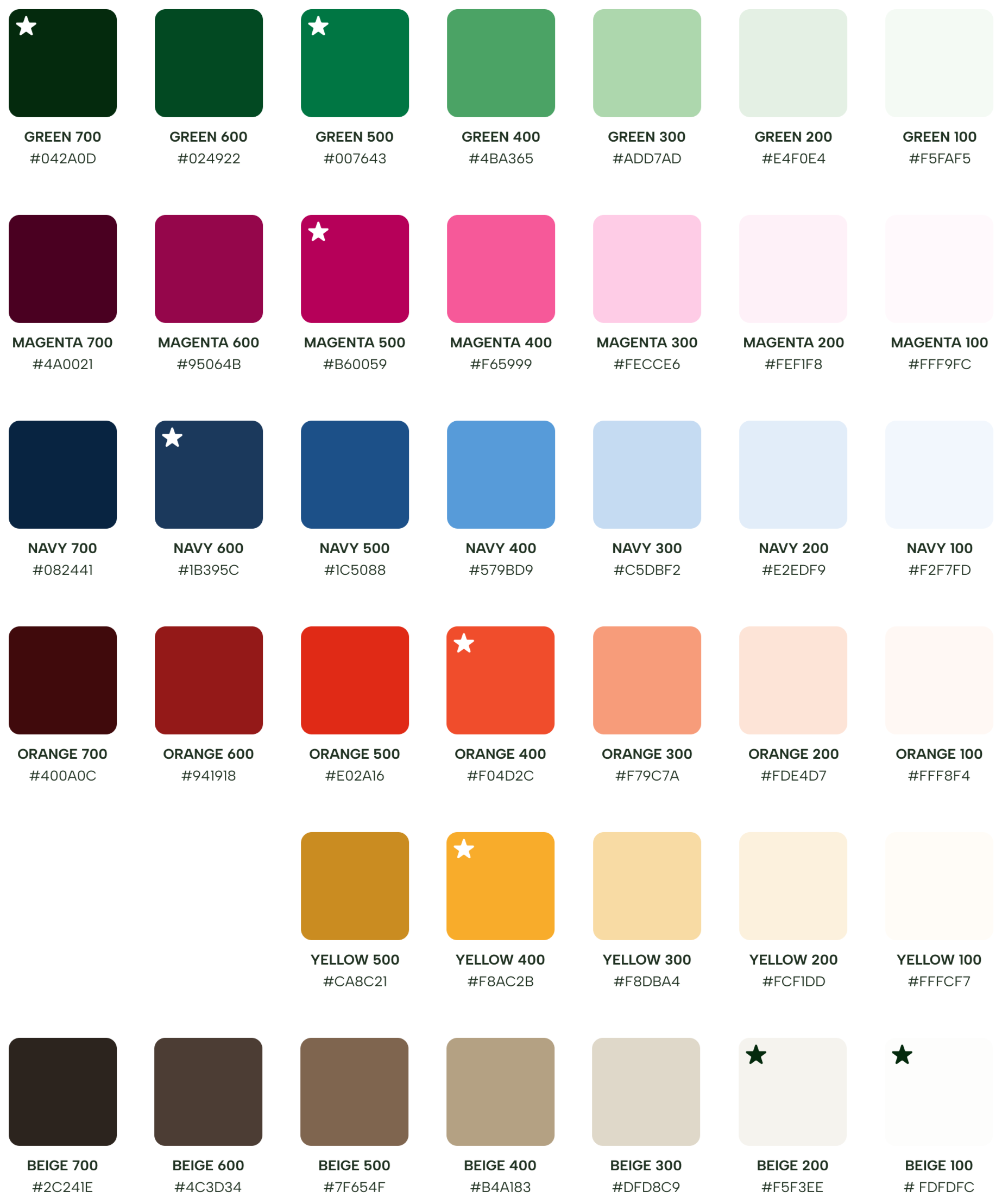
Design system, including color, gradient, icons, tables, typography, buttons, shadows, and components
Filter and search UX
Responsive layouts
Development & Launch
Mapping redirects and handling 404s
QA testing across browsers and devices
Monitoring of performance metrics
Plans for next phase of website improvements
Developed an extended, accessible color palette for the website, which proved so effective it was rolled out as a core element of the larger brand identity system.
I collaborated with a freelance illustrator to develop a series of icons and illustrations.


User Experience Enhancements
Below, I’ve detailed some of the challenges we uncovered during the discovery process, and the design solutions I developed to solve them.
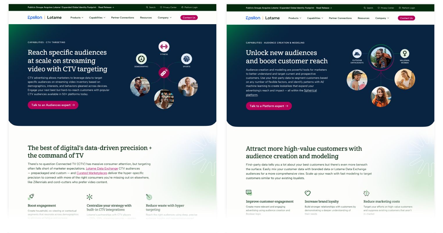
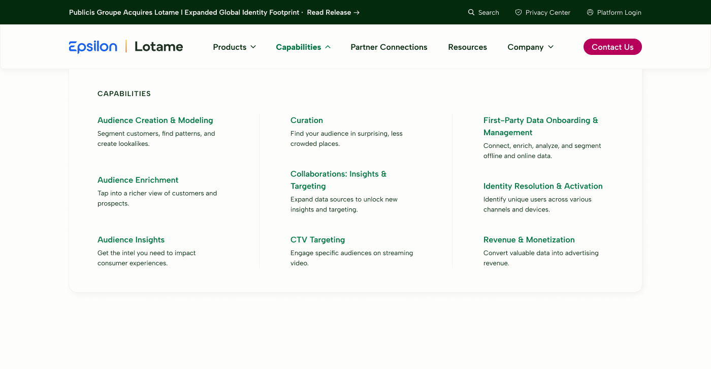
While each page is unique, I designed a series of templates and reusable components to create efficiency across the website. This will be especially helpful as the company’s offerings continue to evolve over time. Pictured below is the template for Capabilities pages, including CTV Targeting and Audience Creation & Modeling.
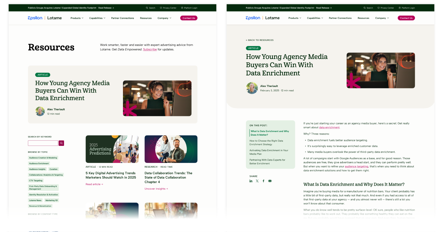
To unlock the full potential of our Blog, a redesign was crucial for user navigation and SEO. My contributions included a modern filter / search UX and a sticky table of contents on individual posts to improve readability of long-form content.
To address user difficulties navigating our website, I developed a more intuitive navigation menu. This enhanced menu includes brief descriptions for each page, and the header now features dedicated spaces to promote relevant content and drive lead generation.
Impact
Engagement metrics have significantly improved since launch, with time on site improving by 5% and engaged sessions improving by 16%.
The Resources page jumped from #31 most visited page to #6 within three months, likely due to our commitment to implementing technical SEO best practices.
Site speed and core web vitals also improved drastically.
In addition, the internal sales team was thrilled to have this pivotal tool to support their sales strategies.
Credits
Web Developer: Steve Babbitt, Mile3 Web Development
Freelance Illustrator: Whitney Souders